ShopDreamUp AI ArtDreamUp
Deviation Actions


Description
[To Page 1]
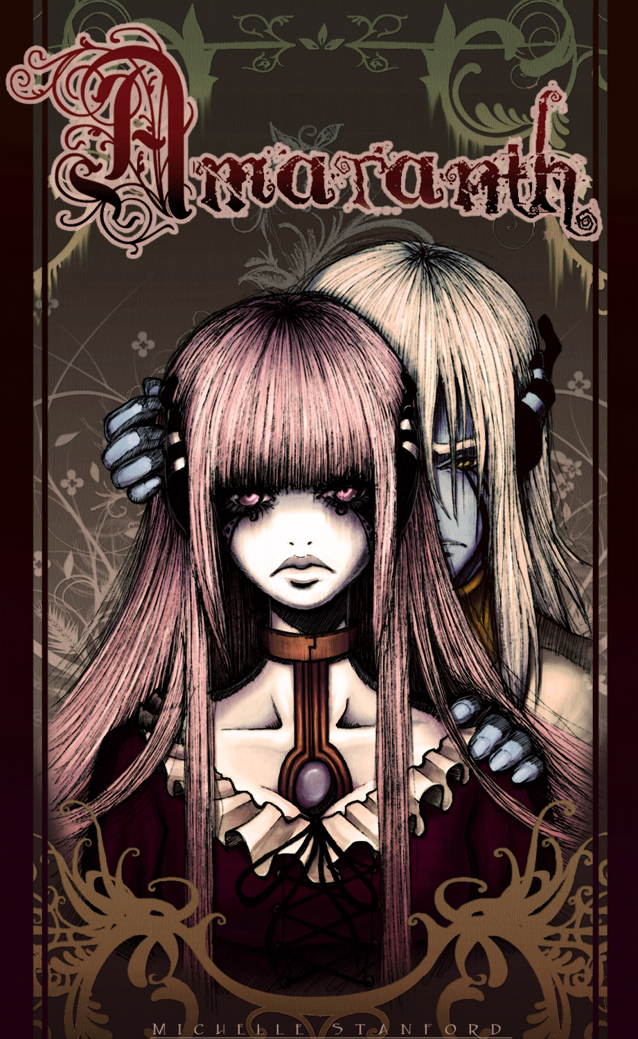
Amaranth tells the story of Morelle, a society of demons ruled by the vain and powerful Si Komei and his enigmatic, doll-eyed Sih Aret. A somewhat peaceful existence is soon tarnished by unsettling apparitions, vicious monsters, and Aret's increasingly unsettling presence. It becomes apparent that Komei is keeping more than a few secrets, and there are some who will go to any length to uncover them.
You can't hide forever . . .
Image size
921x1500px 1.17 MB
© 2007 - 2024 silentillusion
Comments109
Join the community to add your comment. Already a deviant? Log In
Wow, Michelle, you know that I had obviously seen your page before but with all of what happened when I found you I have to say that I was really distracted and now I came back a little more at ease to really look at what you have done and who you are as a human being, an individual and I have to say that your art which is for me a window into our souls and subconscious, is dark, yes but even more, your subjects are evocative in their expression and subtle body language. I love this one, even your choice and use of color. I don't what you call it, anime' or what ever, but most of the stuff I see looks like pokemon to me and I just wanna vomit. I'll say it and I know this isn't going to make me friends at all but that is not what I am here for. I can kind of see which art has your full attention and heart and the stuff that looks like an assignment and the work that you produced from pure inspiration is usually the best.